DESIGNING THE IDENTITY FOR ENERGY DRINK
READY TO DISRUPT THE MARKET
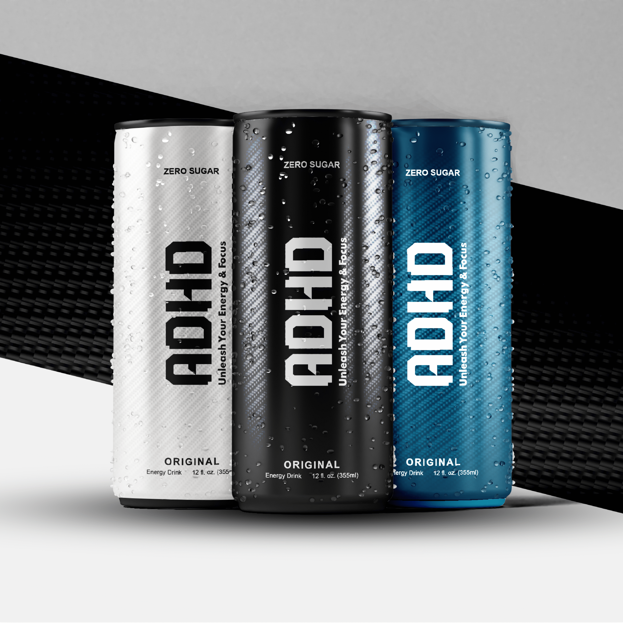
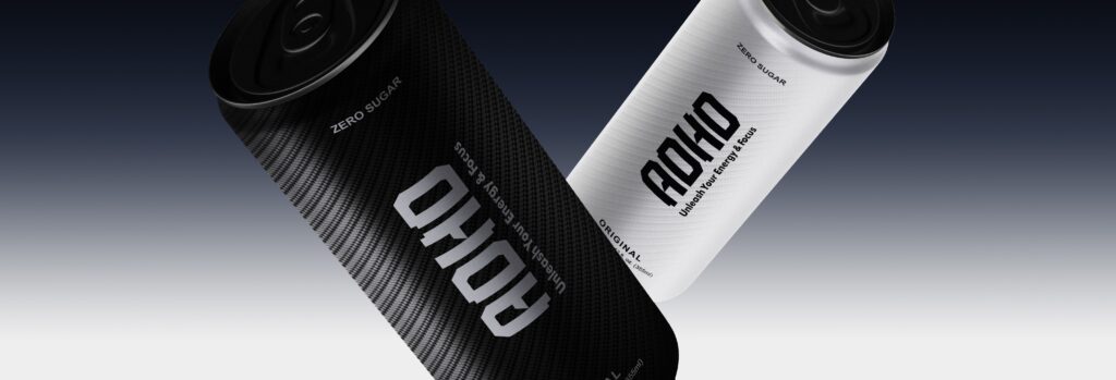
When ADHD Energy Drink came to me, their packaging looked like everything else on the shelf, loud colors, too many elements, and no clear identity. In a market where most brands scream for attention, I wanted this one to speak with intention.
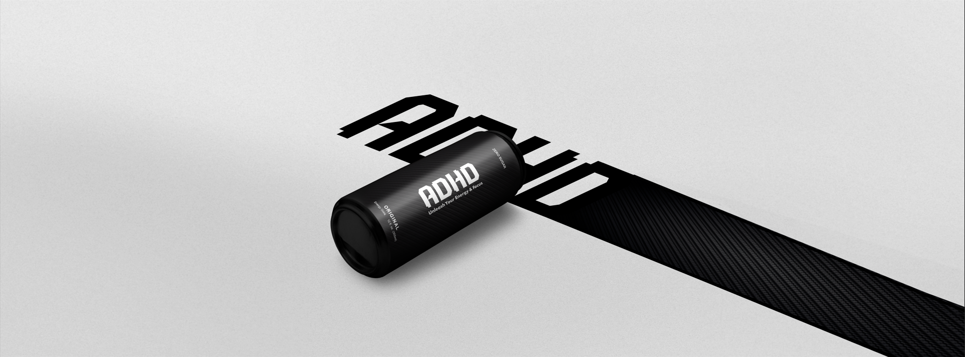
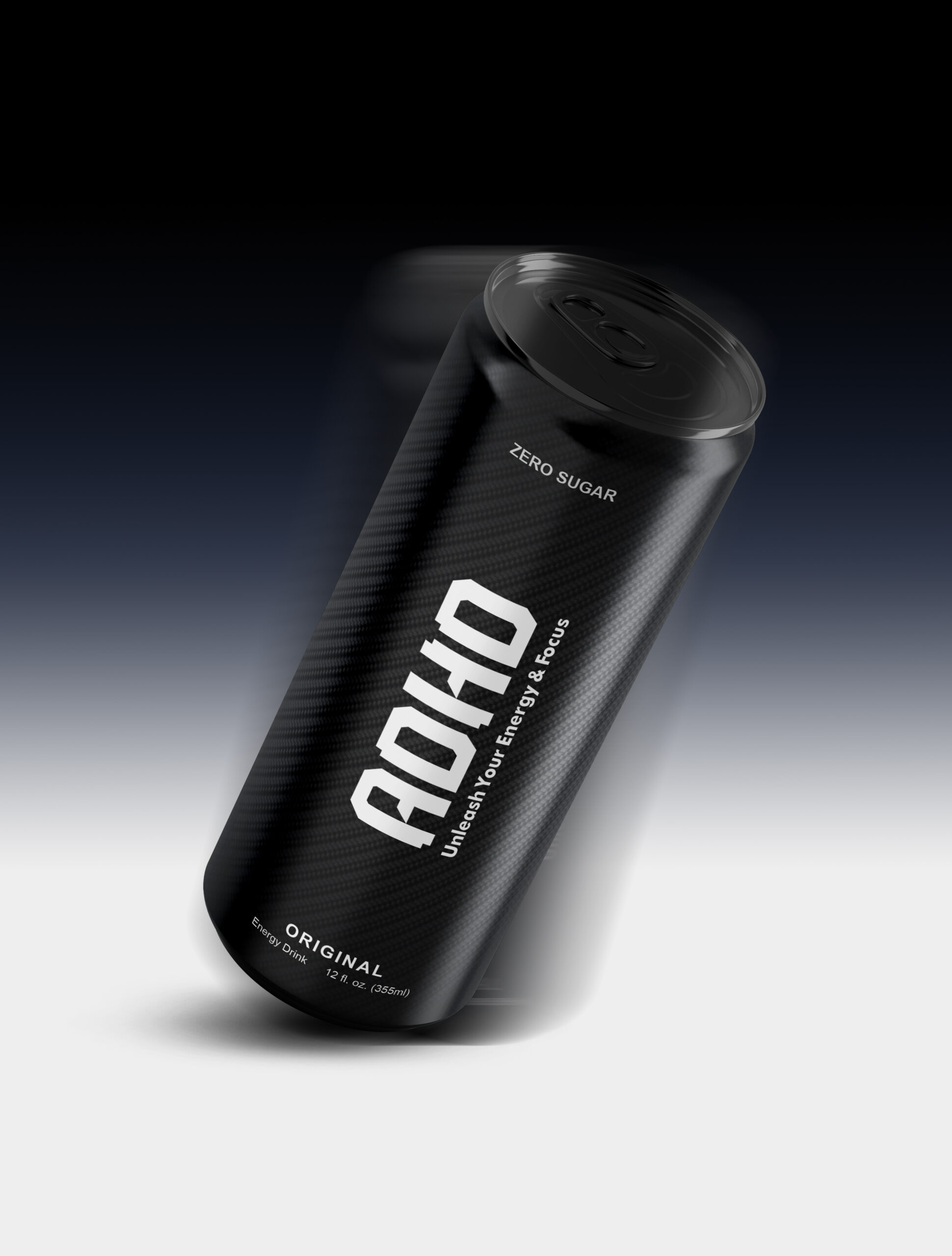
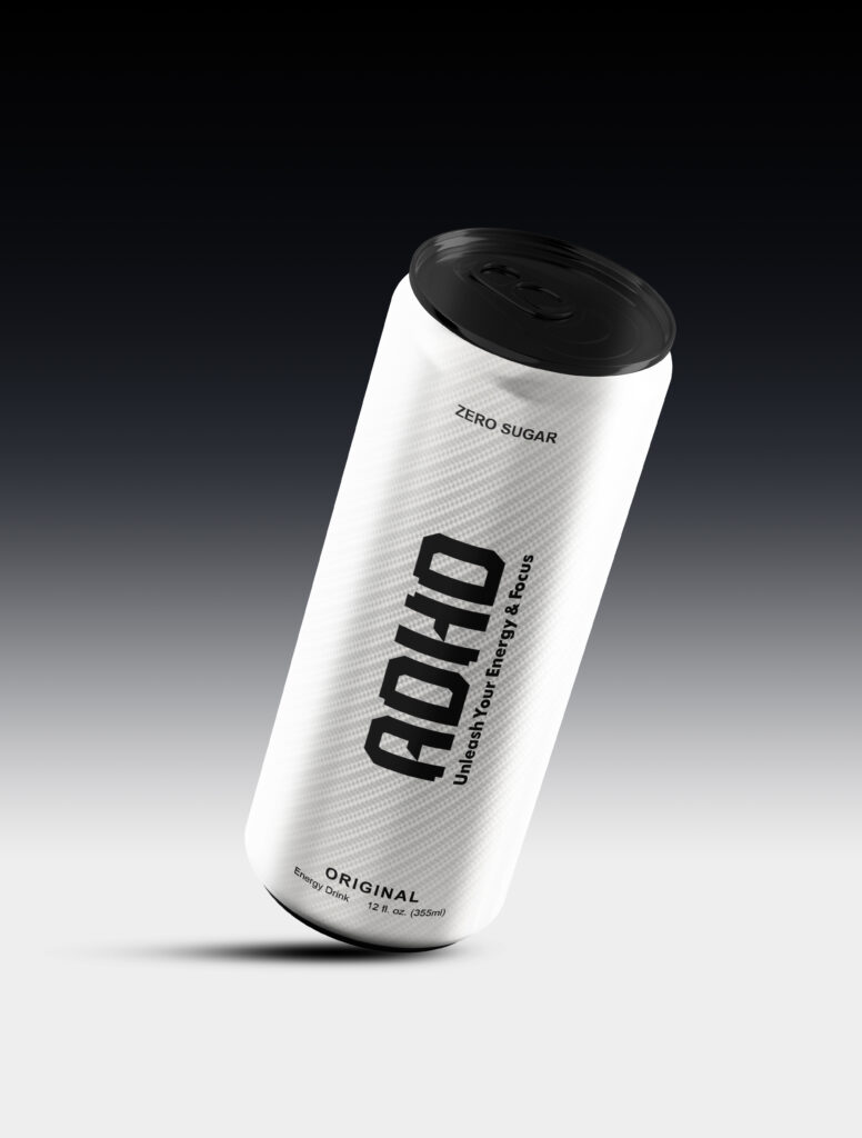
The goal was focus not chaos. I stripped away the clutter, built a clean and powerful layout, and used strong visual structure to make the brand instantly recognizable. The result? Packaging that commands attention without shouting, and reflects the energy and clarity the drink promises.